Was there ever a better encapsulation of the shortcomings of modern architecture than the one Ian Nairn formulated in 1964, a conspectus brought on by, of all things, a consideration of the Penguin Pool at London’s Regent’s Park Zoo?
Modern architecture is hamstrung by self-consciousness and strangled by intellectual inhibitions. It is always what people ought to want, and too often what they had better want or else; almost never what they really want. Everything is done for people, not with them; the whole thing is sick.
I thought of Nairn’s words a few weeks ago as I was walking around Grosvenor Square, the site of the erstwhile U.S. Embassy to Great Britain. That behemoth, a long, low series of articulated rectangular window bays designed by Eero Saarinen in the late 1950s, is described by Nairn in Modern Buildings in London (1964), winningly reissued in September by Notting Hill Editions, as “One of the biggest disappointments in London . . . impossibly over-thought, overworked, over-designed; and all doubtless with the best of intentions.”1 It was those good intentions that Nairn identified as so deleterious to architecture in Modern Buildings (which overall is rather positive) and two years later in a famous piece for the Observer, “Stop the Architects Now,” whose title still resonates today.
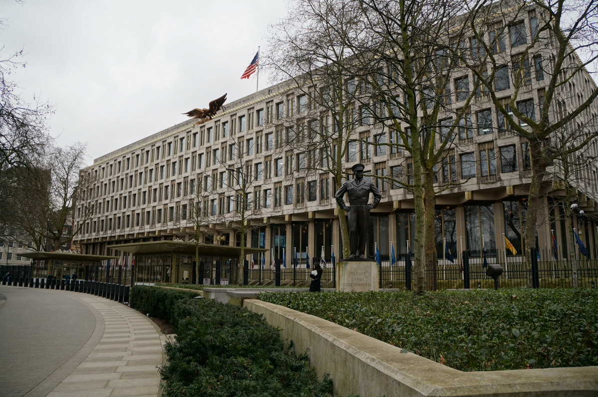
But in the early 1960s, Nairn’s antipathy to modernist architecture had not yet hardened. He thought the American embassy “pompous and tragic” but still maintained that “[i]t is much better for London to have a failure like this than not to have had a Saarinen building at all.” To which one can only say, perhaps.
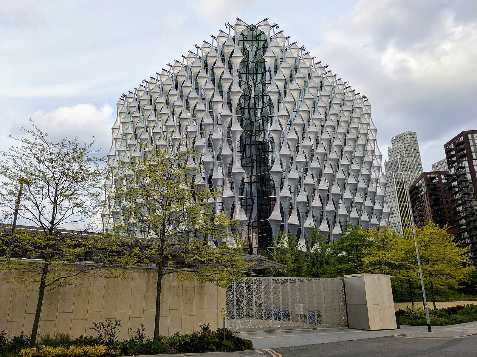
The American embassy moved in 2018 to an area of London just south of the river called Nine Elms, a place that combines an old name (allegedly dating to the seventeenth-century) with new buildings far more pompous and tragic than the prior embassy. One could be in any international city when in Nine Elms, such is the profusion of glass-and-steel apartment towers, sized not for average humans but for the large-walleted international types who think London property a safe place to store cash.
The building is completely decontextualized, like the worst of all modern and contemporary architecture.
The new American embassy, designed by the Philadelphia firm of KieranTimberlake, is a nondescript glass box sheathed on three sides with hourglass-shaped projections, like a netting made of plastic wrap. The building is completely decontextualized, like the worst of all modern and contemporary architecture. Why not play off of Giles Gilbert Scott’s enduring Battersea Power Station just down the road? That 1930s industrial-deco masterpiece, a power-producing ziggurat for a new industrial age, has been repurposed into a mixed-use site with apartments, stores, restaurants, hotels, and all the other amenities that help mere places become neighborhoods. But for the developments in Nine Elms to have referenced Battersea Power Station would be an admission that it is not year zero; an admission that the past has something to teach us; an admission that maybe our ancestors were onto something. Such admissions are not allowed by today’s commissars of architectural taste, but that doesn’t mean they’re not true all the same.
As for adaptive reuse, the old American embassy in Grosvenor Square is a building site now, in the process of being converted into an ultra-luxe Rosewood hotel, whose nightly rates will certainly start in the four-digit range when the project is completed in 2025. Rosewood is based in Hong Kong, and the embassy-conversion project is being financed, as its scaffolding loudly proclaims, by Qatari Diar, the real-estate arm of the Qatari Investment Authority. Despite those overseas associations, the hotel will, owing to its landmark status, have to keep the gilded aluminum bald eagle—“better than the building, but . . . too high up to be seen properly,” said Nairn—that crowns the façade. In closing his thoughts on the old embassy, Nairn suggested that “if London calls itself an international city, it ought to be prepared to back up the claim.” It has, but at what cost?
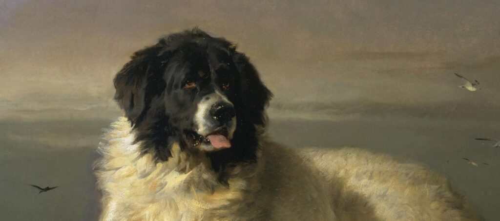
Such grim notions were banished from my mind as I approached the Wallace Collection in Marylebone, always a tonic place to visit. The destination was the soon-to-close exhibition “Portraits of Dogs,” a show that probably could only be mounted successfully in England, where dogs are close to a national religion.2
The pose of the two dogs parodies the common Dutch genre scene of a human leaning out a window.
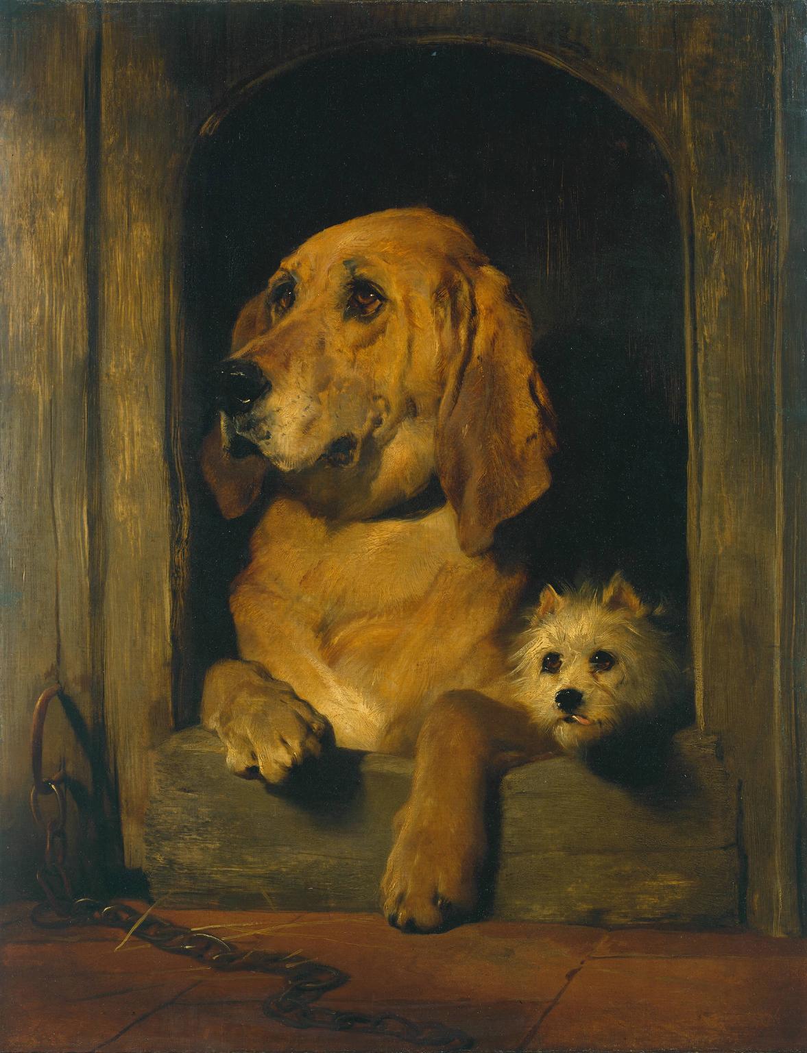
In a show of pooch pictures, a large selection of the work of Sir Edwin Henry Landseer (1802–73) is of course to be expected. Was there ever a painter so devoted to the depiction of canines? But “Portraits of Dogs” had Landseers in excess. Of the fifty or so works on view in the downstairs special-exhibitions galleries, I counted twenty by Queen Victoria’s favorite painter, a man so ensconced in the dog world that a breed was named after him. Even ten Landseers may have been justified, given the artist’s prolificacy (both in number and theme) in the painting of dogs, but some 40 percent of the works on view seemed too much. Still, who is not glad to see Bob, the heroic Newfoundland depicted in A Distinguished Member of the Humane Society (ca. 1838)? Though we encounter the large lifesaving dog in Landseer’s painting, Landseer himself never met the much-decorated Bob. As the show’s catalogue relates, when the time came for the portrait sitting, Bob was nowhere to be found, and so Landseer used a cousin’s dog, Paul Pry, as a stand-in. And while that winning picture—with its dour blue-green background portending the stormy waters that Bob was so adroit in—transcends its pokey genre, Landseer’s allegorical Dignity and Impudence (1839) is a drawing-room laugh item. Grafton the bloodhound is all gravity: serious and earnest. Scratch the Westie, however, is a little imp, his tongue mischievously poking out of his tiny mouth. But Landseer was too historically conscious an artist to offer a mere trifle: the pose of the two dogs parodies the common Dutch genre scene of a human leaning out a window.
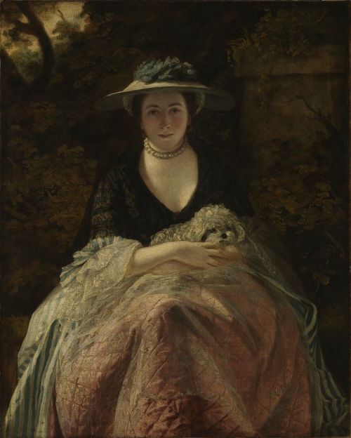
Of the non-Landseers, a few standout items enlivened the selection. Thomas Gainsborough’s grand-manner portraiture, full of haughty Georgian lords and ladies, could hardly prepare one for his Tristram and Fox (ca. 1775–85), an exceedingly tender dual portrait of his and his wife’s canine companions. Fox is a little sheltie, a collie made miniature, with an alert gaze and wispy coat that the artist ably picks out in rough brushstrokes. Tristram, some sort of dark spaniel, is a more shadowy presence, with his dark coat receding into the brown background of the composition. The painting is said to have hung over the fireplace of Gainsborough’s London house, and what it lacks in grandeur it makes up for in good-heartedness.
Perhaps stretching the bounds of the exhibition’s remit was a sketch sheet by Leonardo da Vinci with various studies of dog paws (ca. 1490–95), on loan from the National Galleries of Scotland in Edinburgh. These carefully observed paws, rendered in metalpoint on both sides of a piece of paper, show the keen anatomist at work. On one side are four paws, three in three-quarters profile, the other seen head-on. Leonardo, in these related but not identical versions, tinkers with nail length and shape: long and short, curved and straight. We track the artist’s mind through his metal marks on the recto side and see that mind at work on the verso. But here the paws are vivified, with scraggly fur that almost appears in motion. Both realistic and impressionistic, these paws are breathtaking. The sheets aren’t portraits of dogs, but they alone are worth the price of admission.
Those Leonardo pages, outside the technical bounds of the show, might have been an argument for a broader conception, perhaps “Portraits with Dogs” or even “Pictures with Dogs.” As I wandered around the Wallace’s permanent collection after seeing “Portraits of Dogs,” I could not help but spot so many canine characters peeking in and out of various works ostensibly about something else. Perhaps the show was slightly too literal: couldn’t the Wallace have brought down Joshua Reynolds’s Miss Nelly O’Brien (ca. 1762–64), a cool, dark portrait of a courtesan with her toy poodle? That picture hangs next to Gainsborough’s Mrs Mary Robinson (Perdita) (1781), which offers an even more frigid variation on the lady-and-dog genre, with the ghostly, supercilious subject flanked by her attentive dog, some sort of shepherd by the looks of it. I marveled, as always, at Gainsborough’s facility with the color blue. And while we’re at it, what about Reynolds’s Miss Jane Bowles (1775–76), a winsome portrait of a little girl clutching a spaniel to her chest? That picture’s forested background bears a striking resemblance to that in the earlier Miss Nelly O’Brien. A room downstairs of Georgian worthies with their dogs? It would have been welcome.
Hockney’s pictures, by contrast, are all warmth.
Still, the show, limited in conception as it was, had enough to keep the casual visitor (and the occasional live service dog) satisfied. An entire room of David Hockney’s pictures of his dachshunds Stanley and Boodgie seemed dedicated to the principle of give the people what they want, at least to judge by the crowds assembled there. These blithe little portraits—of which the Wallace presented five from Hockney’s series of forty (dating to between 1994 and 1996)—had a warmth unusual in the show. While Gainsborough could strip away his grand manner to present an intimate view of Tristram and Fox, there is a natural chilliness to his palette. Hockney’s pictures, by contrast, are all warmth: the mahogany of the dogs’ coats; the vibrant yellow-and-blue beds on which they adopt various poses; the subtle green or blue or green-and-blue backgrounds that make the dogs themselves pop off the canvas. No wonder the Hockney room had the steadiest stream of visitors: in a show in which even loving portraits had an air of gelid majesty, Hockney’s depictions of Stanley and Boodgie are attractively fond, expressing the contemporary view of dogs as near-children, an idea that, for professional artists at least, would have been foreign in previous centuries.
Dr. Johnson famously declared that he would “rather see the portrait of a dog I know, than all the allegorical paintings they can show me in the world.” At the Wallace, with Poussin’s Dance to the Music of Time (ca. 1634–36) just two floors upstairs, one didn’t have to choose.
On the ground level—one floor down from the bulk of the Wallace’s holdings and one floor up from the dogs—is a small show shunted off to a side room just left of the entrance. Unheralded but rewarding, “Turner and Bonington: Watercolours from the Wallace Collection” presents works in the museum’s permanent collection that have not been seen publicly in nearly two decades.3 That absence has been a practical consideration: these fragile watercolors cannot take too much light (where Goethe said “more light,” watercolors say “less”).
But while light from without is death to watercolor, light from within is one of the medium’s hallmarks. Joseph Mallord William Turner (1775–1851) was, however, no Pangloss, and neither his days nor his works had the quality of sunniness. He is reputed to have said, “If I could find anything blacker than black, I’d use it,” and a familiarity with his major works, such as Fishermen at Sea (1796), in the collection of Tate Britain, leaves one in no doubt as to the veracity of that quotation.
And yet there is something gentler, indeed lighter, about the Turners on display in “Turner and Bonington.” That owes to their creation in the north of England, a place with deep resonance for the artist. For it was in the north that Turner “discovered himself and his future direction as a painter of landscape,” as David Hill wrote in his 1996 book Turner and the North, published to mark exhibitions in London and Yorkshire of Turner’s northern work. John Ruskin, purple as ever, described Turner’s 1797 sketching trip to the north this way:
And at last fortune wills that the lad’s true life shall begin. . . . [H]e finds himself sitting alone among the Yorkshire hills. For the first time, the silence of Nature round him, her freedom sealed to him, her glory opened to him. . . . Loveliness at last.
As Hill notes,
Although Ruskin’s account is fanciful in many respects . . . it seems to contain an essential truth: that in the north Turner discovered a quality of experience which was new, and to which he devoted himself thereafter.
It was this shift, from painting architecture to landscape, that made Turner’s career.
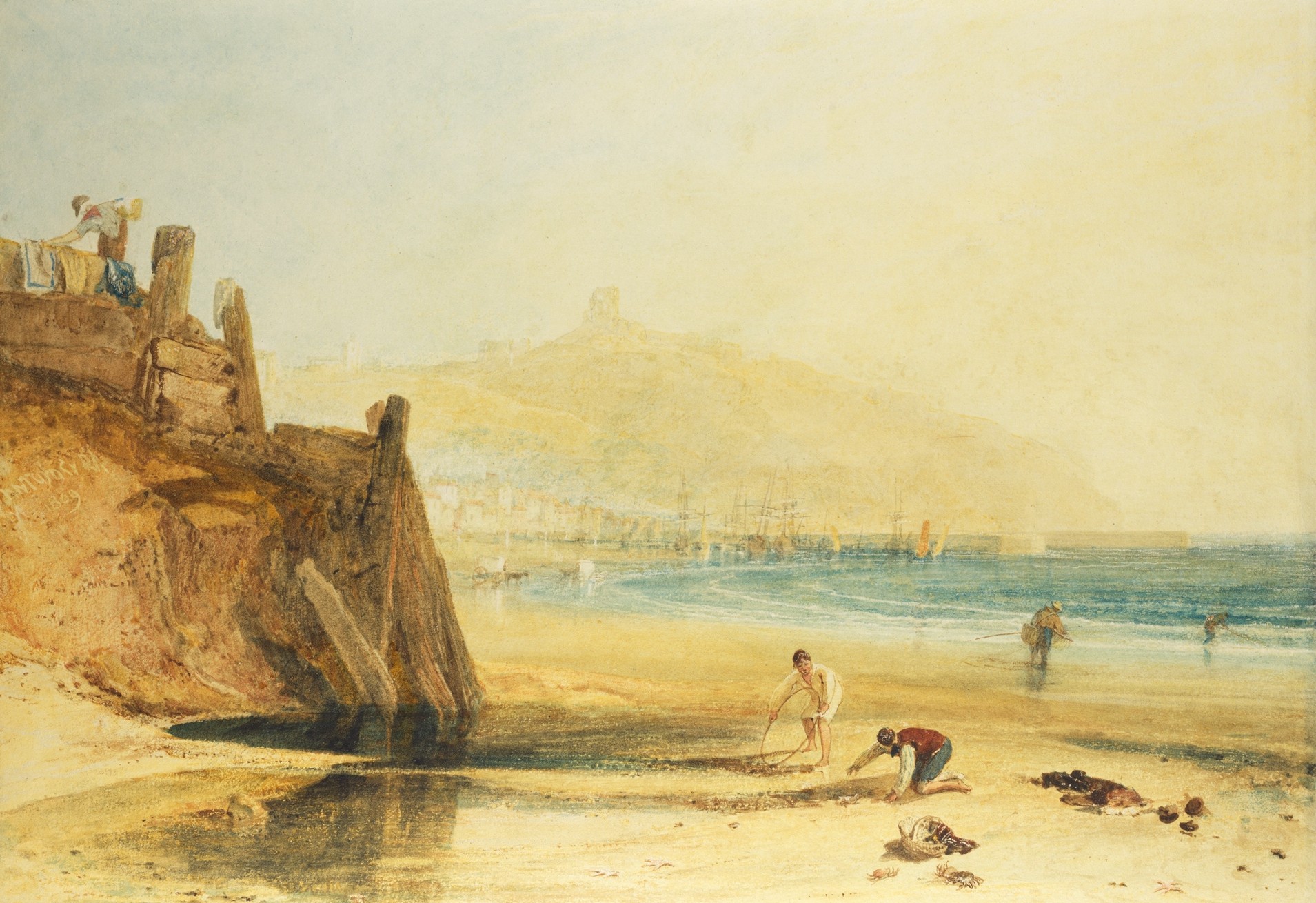
None of the four Turner watercolors here is from that first fateful trip; the earliest is a seaside scene from 1809, Scarborough Castle: Boys Crab Fishing. Even ten years after Turner’s first journey northwards, his interest in the built environment, particularly the ruinous or historical aspects of it, remained. In the foreground is almost a genre scene, with two children crabbing in a tidal pool on Scarborough sands. A yellow haze suffuses the canvas, overlaying even the blue of the coastline that juts in, and especially hanging over the gauzy rendering of the ruins of Scarborough Castle on the hill above.

That yellow turns to gray-beige in Grouse Shooting on Beamsley Beacon (1816). Here we are far from the coast, upon a hill in the Yorkshire Dales. The artist has painted himself into the foreground, a hunter in tan coat and breeks, with high leather boots to guard against gorse-cuts. To his right is another member of the shooting party, while moving toward the background are further figures, two on horses. Beyond, the painting dissolves into a mist of neutrals, the hills appearing as the barest hints of purple-green. It was in this still north that Turner found his métier, and it was to the north that he continuously turned for artistic inspiration.
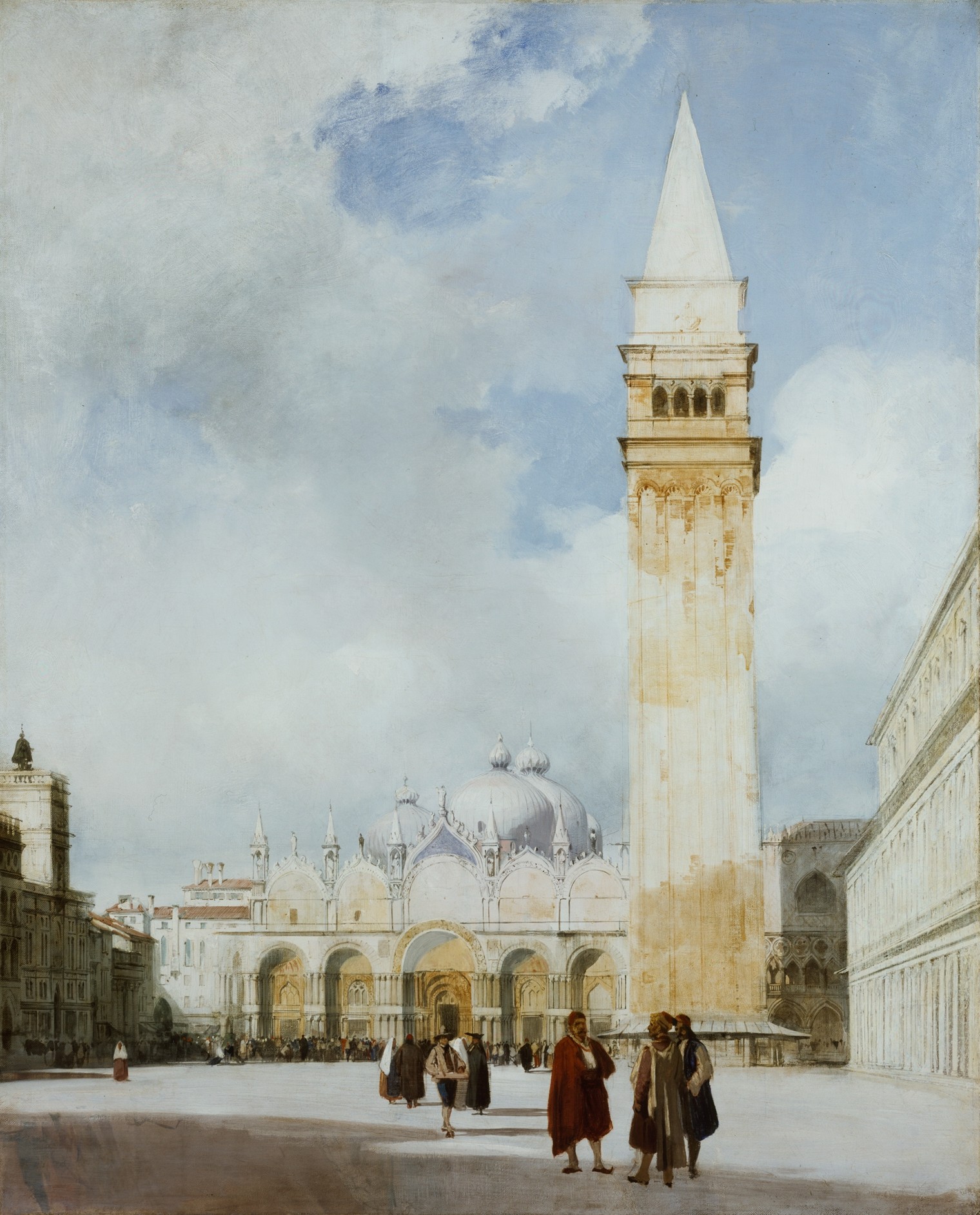
Richard Parkes Bonington (1802–28) was born in the Midlands, near Nottingham, but found himself in Calais at the age of fourteen, where his father’s work had taken him. His style and palette clearly owe something to Turner, but Bonington’s subjects, at least the ones on view here, take us away from the English north and onto the Continent. Whereas the Turner watercolors on view are sturdy in their commitment to the English picturesque, Bonington’s have an exoticism in both subject and manner. The lightness of his watercolor brush is on full display in The Piazza San Marco (1828), whose powder-blue sky wisps into off-white clouds. But the real triumph is the way the cream pavement of the piazza contrasts with the weathered amber of the campanile of the basilica. Halfway up, the amber tower becomes cream again, though a yellower cream than the pavement, before turning to amber again at the loggia. The spire at the top, capping off this run of subtle tones, is a study in a purer white. So captivated was I by Bonington’s colors that I almost missed the human figures that populate the foreground.
The other Boningtons on display—two more of Venice, two French harbor scenes, and a cliffside sunset—attest to what Delacroix called the young man’s ability to make “his works a type of diamond which flatters and ravishes the eye.” These diamonds, and Turner’s own rougher stones, sparkle in the Wallace’s newly unveiled ground-floor exhibition space, made possible by a £50,000 grant from the dcms/Wolfson Museums and Galleries Improvement Fund. The Wallace will continue to work its tonic effects.
- Modern Buildings in London, by Ian Nairn; Notting Hill Editions, 176 pages, $21.95.
- “Portraits of Dogs: From Gainsborough to Hockney” was on view at the Wallace Collection, London, from March 29 through October 15, 2023.
- “Turner and Bonington: Watercolours from the Wallace Collection” opened at the Wallace Collection, London, on September 20, 2023, and remains on view through April 21, 2024.