Say “Mark Rothko” and we visualize the signature works that have become synonymous with his name—the so-called Classic paintings, large canvases constructed with soft-edged floating rectangles of disembodied color, some radiant, others brooding and dark. But Rothko (1903–70) didn’t start out making paintings of this type. Born Marcus Rothkowitz in Dvinsk, Russia (now Daugavpils, Latvia), he immigrated at the age of ten, with his family, to Portland, Oregon. In 1923, after two years at Yale, he moved to New York and enrolled at the Art Students League, where he began painting representational images loosely derived from Cézanne. By the late 1920s, Rothko had forged a close friendship with Milton Avery, and by the early 1930s, like the older artist, he was painting expressionist figures.
Yet Rothko showed landscapes, rather than figures, in his first (and critically well-received) one-person exhibitions, held in 1933, in Portland and at the Contemporary Arts Gallery, New York, perhaps because he thought they were more marketable. And everything changed in the mid-1940s, when Rothko abandoned representation, first experimenting with Surrealist-inflected dreamscapes that announced him as an innovator to be reckoned with and then, despite the attention awarded to these symbolic images, gradually eliminating even fleeting allusions. But it wasn’t until 1949 that he began making the economical, elegant abstractions that his name conjures up—paintings so stripped to essentials that they repudiate totally his early interpretations of the world around him and even put to question the haunting works that established his reputation in the mid-1940s.
The journey from Cézannian landscapes and loose-limbed figures through symbolism to pared-down abstractions is charted in detail by “Mark Rothko: Paintings on Paper” at the National Gallery, Washington, D.C., organized by the museum’s associate curator Adam Greenhalgh, the lead author of the Rothko catalogue raisonné.1 The title is precisely accurate. The works on view are made variously with watercolor, ink, acrylic, and even occasionally oils on different kinds of paper supports, but they are never sketches or studies. Everything in the exhibition is as ambitious and complete as any work on canvas, an equivalence emphasized by Rothko’s wanting his paintings on paper to be mounted and presented as if they were stretched canvases, without frames, rather than being matted and put under glass, like conventional watercolors. He clearly did not regard works on paper as secondary. In various campaigns during the four-plus decades of his working life, he made astonishing numbers of them, many quite large, sometimes coexistent with canvases. His exhibitions of large watercolors in New York and San Francisco, in 1946, were, in fact, his first commercially successful shows, and the works he considered to be his first mature efforts were watercolors. His 1961 exhibition at the Museum of Modern Art, New York, for which he helped to select paintings, began with four watercolors from the 1940s. They were the earliest works included, a signal of how he saw his evolution.
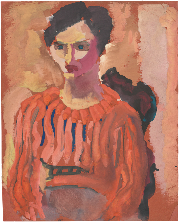
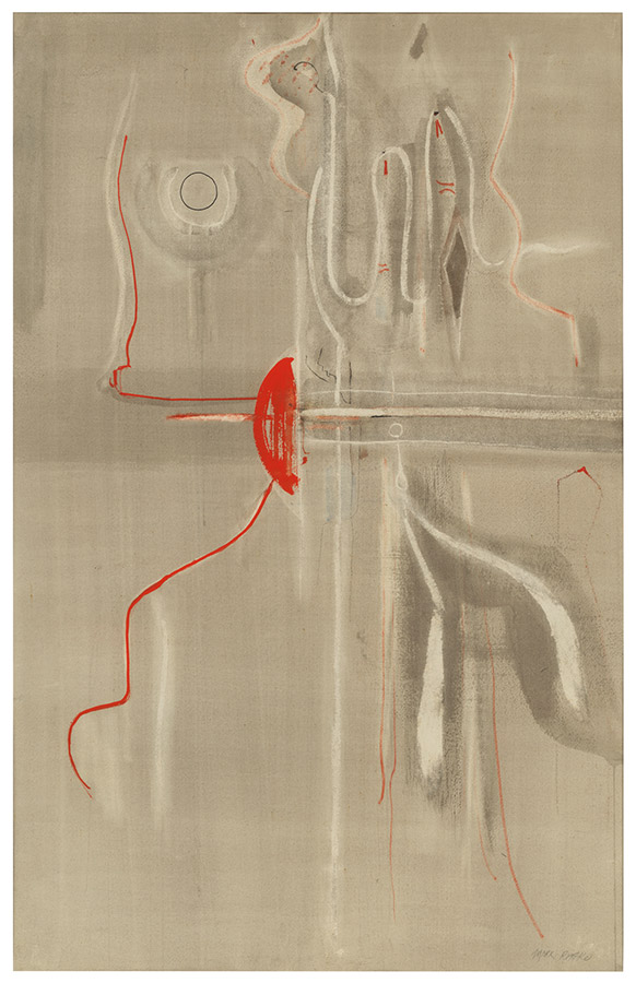
The first gallery of “Mark Rothko: Paintings on Paper,” devoted to works from the early and mid-1930s, is perhaps best considered as a backstory. We encounter views of the landscape near Portland translated into Cézannian repetitive touches and rhythmic strokes, with an appealing sense of light; in the most successful of these—views of the city from a high vantage point—references to buildings and man-made structures add a strengthening subtext of geometry to the patches of foliage. We meet chunky figures, mostly clothed and seated, built with emphatic brushstrokes, and some thickset nudes. A woman in a blue coat, sitting in a red armchair, seems an homage to Cézanne’s portrait of his wife in a similar chair. Casually constructed figures on the beach, in tender colors, bear witness to Rothko’s friendship with Avery. Some are sturdy, while other wispier characters threaten to dissolve into vertical brushmarks, preparing us for what comes next: gatherings of ambiguous biomorphic creatures, now aquatic, now insect-like, now suggesting microscopic life-forms, always mysterious and usually arrayed vertically, like performers on a shallow stage, called into being with soft-edged pools of color and heartbreakingly delicate drawing. Color is usually subdued, at times earthy, with browns and tans bleeding into deep blues and reds; at other times, whites drift across like low-lying clouds. The fragility and suavity of Rothko’s drawing contrasts with occasional bleeds and, more frequently and dramatically, with vigorous wiping out or even scraping of the robust surface.
Moving through the installation, we discover that, as is always true of Rothko’s mature paintings on paper, the variations in paint application he devised, from ineffable transparencies to fierce swipes, become integral to the mood and affect of the works. None of this is visible in reproductions, which makes the opportunity to see the real thing irreplaceble. (It can be argued, however, that at just under one hundred works, many closely related, and most, except for the earliest and latest, about the same size, “Mark Rothko: Paintings on Paper” is a little too much of the real thing.)
Rothko’s enigmatic watercolors of the mid-1940s remind us how fascinated he and his circle were by the archaic, the primitive, the mythological, and the idea of the collective unconscious. His friend Adolph Gottlieb alluded to alchemy and the story of Oedipus in his Pictographs. His colleague David Smith haunted the Egyptian collection of the Metropolitan Museum. Rothko’s titles, such as Prehistoric Memory, Ancestral Imprint, Omen, and Vessels of Magic, to list only a few, offer clues to his aspirations. Sir J. G. Frazer’s The Golden Bough: A Study of Magic and Religion, a compendium of how corresponding myths run across cultures and through time, seems to have been widely read or at least discussed by artists in the 1930s and ’40s, the way publications of Zen Buddhism were in the 1950s, while in 1943 the literary quarterly Chimera devoted an entire issue to myth and the influence of Freudian and Jungian theories of how myths are reenacted in our lives. In June of that year, Rothko and his friends Barnett Newman and Gottlieb affirmed their interest in myth and symbol in a letter to The New York Times responding to a bewildered critic’s review of the 1943 Federation of Modern Painters and Sculptors exhibition. “There is no such thing as a good painting about nothing,” they wrote. “We assert that the subject is crucial and only that subject matter is valid which is tragic and timeless. That is why we profess spiritual kinship with primitive and archaic art.”
Rothko soon stopped titling his works, but his imagery (at least for a while) remained unchanged, as did his avowed subject matter. Even when he was acclaimed internationally for his Classic paintings, recognized as a master of luminous, disembodied zones of just plain, beautiful color detached from any vestiges of reference, he insisted that he was interested only “in expressing basic human emotions—tragedy, ecstasy, doom” and described himself as “the most violent of all the American painters. Behind those colors there hides the final cataclysm.” Whatever we think of this characterization, “Paintings on Paper” allows us to follow how different ways of putting on (and taking off) paint—dry sweeps, rhythmic streaks, abrupt wipes, transparent layerings—begin to overwhelm the suggestions of abstract personages in the watercolors of the 1940s. In an untitled work made about 1947—a loose fabric of patches of tawny browns and silvery grays—the frail outlines have disappeared, so that the zones of color float free.
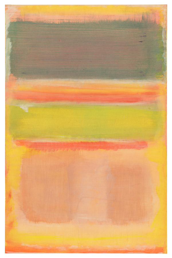
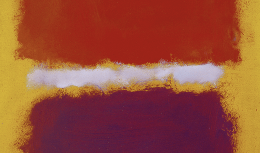
Next step, beginning in the late 1940s: the Multiforms, compositions of largish, ragged-edged zones of thinly applied color that jostle each other for dominance and/or compete with small pats and strokes. There’s a lot going on in the Multiforms, sometimes a little too much for their size. Color has intensified to clear yellows, oranges, and pinks in the works at the National Gallery. Rothko’s impulse, we discover, was to simplify and clarify. We next encounter an assertive stack of broad, horizontal bands cutting across a vertical sheet. In Untitled (ca. 1949), extended rectangles are layered over other rectangles barely glimpsed beneath them, shifting, elusive expanses of closely related hues that nevertheless influence the color imposed on top: transparent gray/green brushed over pink, murky yellow/green over orange, chalky salmon over yellow, with two duller, warmer orange blocks subdividing it; trails of red and orange escape from underneath. That none of the colors is precisely nameable is an indication of Rothko’s strength as a colorist at his best.
The rest of the exhibition is dedicated to works made between 1956 and 1969, with the majority dating from the last two years of Rothko’s life before his suicide early in 1970 at the age of sixty-six. They are essentially Classic paintings, vertical and confrontational, with their paper supports mounted in various ways so that they are hung on the wall like stretched canvases. They range from slightly under three feet to six feet high, their mood shifting from intense and clamorous to dulled-down and reticent, with the taped-off white borders of the late works heightening the implicit drama of the interior. In the strongest works, Rothko surprises us with his orchestration of hues. Saturated blues, blacks, misty grays, and dull reds like barely extinguished embers can seem to have more presence as color than full-bore yellows, reds, and oranges. The dark paintings can be eye-testing and rewarding. Several 1969 paintings demand attention with ample black blocks hovering over purple or ultramarine; in one, an escape below of warmer mulberry changes the mood, while in another, an almost unseeable difference between blocks of red/black and green/black becomes overwhelmingly important.
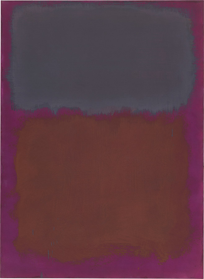
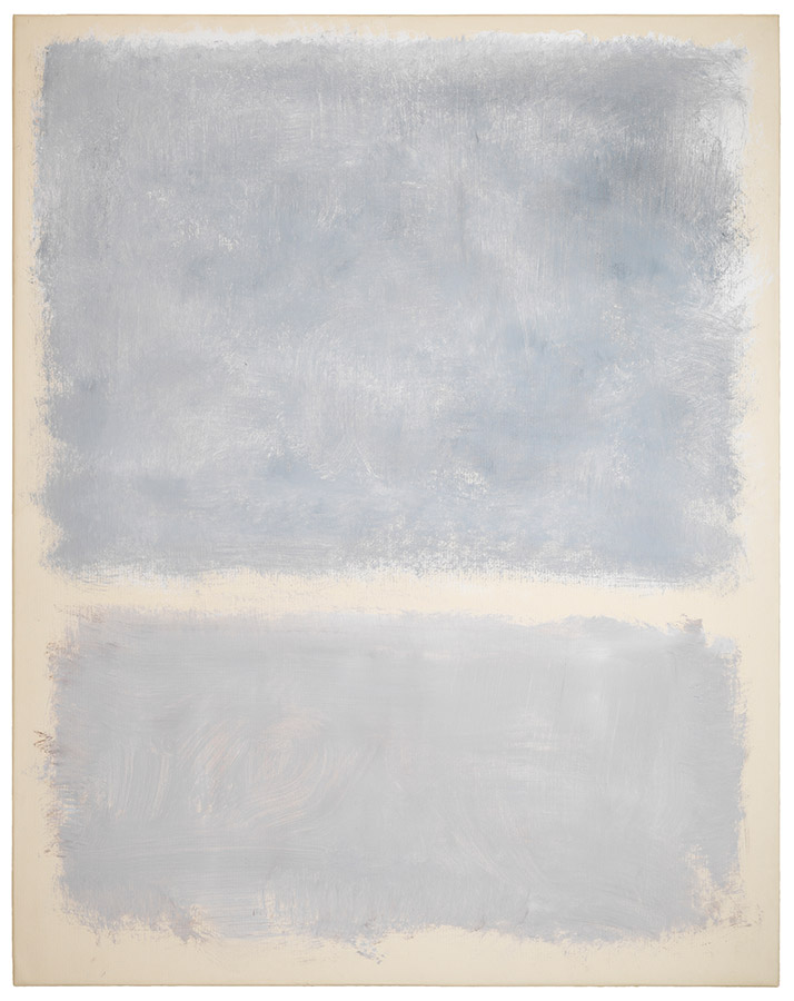
Given Rothko’s ability to animate and keep us engaged by what we might call “non-colors,” the selections from a series known as Brown and Grays come as a surprise. The works on view range from five to six feet tall, each divided into two sections, one brown, the other subtle permutations of gunmetal and tarnished silver. The “horizon” where the two zones meet or overlap is at a different height in each of the exhibited works, but despite this variation in structure and despite the aggressive brushmarks agitating the fields of brown and gray, the results are strangely inert. The wall text tells us that when Rothko showed the series to friends and fellow artists, they were nonplussed by the somber quality of the works; the artist, we learn, was surprised and disappointed by their lack of enthusiasm. (Elsewhere, the labels can be overly literal, rather than informative, equating bright color with happiness in Classic paintings or urging viewers to interpret the enigmatic forms of the surrealizing works as figures.)
To avoid triggering the disappointment of the Brown and Grays’ first viewers, the installation ends on a more cheerful note, with a group of works, also made in 1969, that explore fresco-like, relatively high-key color. They are presented as a coda even though they do not postdate the bleak Brown and Grays. Like the Brown and Grays, the works in the show’s finale are built of two main blocks of color, sometimes with slim, emphatic bands above and below; like the Brown and Grays, too, they are tall and layered. They revel in complex, almost indescribable hues—damped-down pink, faded rose and salmon, silvery grays, and Piero della Francesca blues, often tempered by hints of something we can’t quite identify underneath. The vigor of the broad brushstrokes with which Rothko has built these forthright paintings brings the most compelling of the series to life.
That we can see those brushstrokes is crucial to our experience of just about all the mature work in “Paintings on Paper.” Rothko sometimes combined media, exploiting the particular characteristics of each for its formal possibilities as well as its expressive effect. In the surrealizing works of the mid-1940s, he used ink for slender lines and watercolor for pools of color, sometimes combining opaque and transparent watercolor in the same work. In the 1960s, he employed oil on watercolor paper and then, like many of his colleagues, adopted acrylic in 1968. Whatever the medium, Rothko made us aware of his hand, leaving visible evidence of the energy with which he transferred pigment to a surface. The physicality of the paintings on paper at the National Gallery is one of their most striking characteristics. The floating blocks of color in Rothko’s paintings on canvas can seem to possess color without materiality, as if he were somehow presenting us with redness or blueness as a purely visual phenomenon, wholly abstracted, for the eye only. (Whether that visual phenomenon conveys tragedy, ecstasy, or doom, as well as triggering a limitless set of wordless associations, is a question for the individual viewer.) Rothko’s paintings on paper are more substantial, probably because of the way paint sits up on a hard surface. Spend time at the exhibition at the National Gallery, and you can mentally recapitulate the history of the making of the works on view, ponder what Rothko did and when he did it, and speculate about why. It’s the closest we’ll come to watching him work.