In what marks the latest act of its inexplicable, costly crusade to modernize and rebrand, the Metropolitan Museum this week mailed its members new membership identification cards. This is not, in itself, all that troubling—on the contrary, the cards represent several positive changes to the membership program, including new guest privileges and an increase in lectures and evening receptions. However, like the Museum’s new logo, which was greeted last year with a mixture of bewilderment, derision, and contempt, the cards feature a tone-deaf redesign that betrays an institution struggling with its identity, its values, and its role in contemporary life.
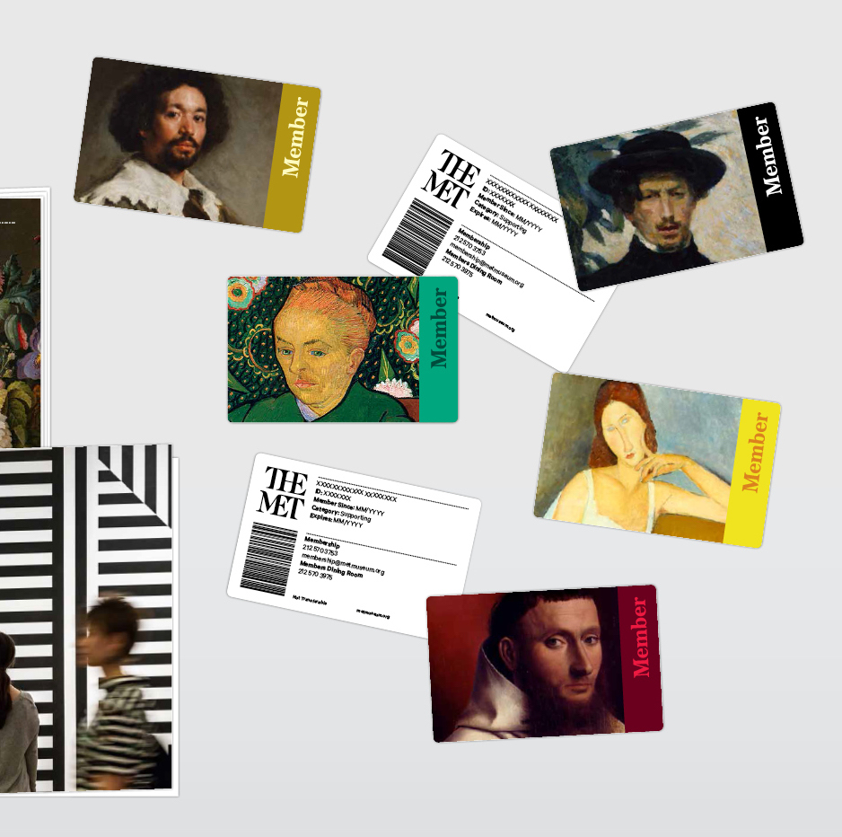
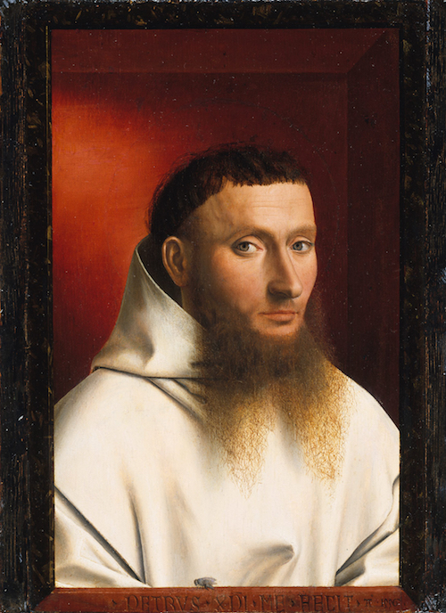
Until now, members have, at the start of each year, received a card, the size and shape of a credit card or driver’s license, bearing on its front the image of some classic work in the Met’s collections. The card for 2017, for example, depicted Portrait of a Carthusian by the fifteenth-century Netherlandish painter Petrus Christus: an austere monk, robed in white, peered out at each card-carrying member from his blood-red trompe-l’oeil frame. Alongside the painting was written the word “Member” in an elegant typeface. There were no bells or whistles—the card let the painting speak for itself.
The new card, by contrast, is a barren navy blue with all the charm of a gym membership ID. The Museum’s lopsided, redesigned logo, “THE MET,” tumbles over itself in the bottom left corner, and at the top, enclosed in a doily of thin white lines and little white crosses, severe, un-centered, capital letters spell out the slogan, “MEMBERS COUNT.”
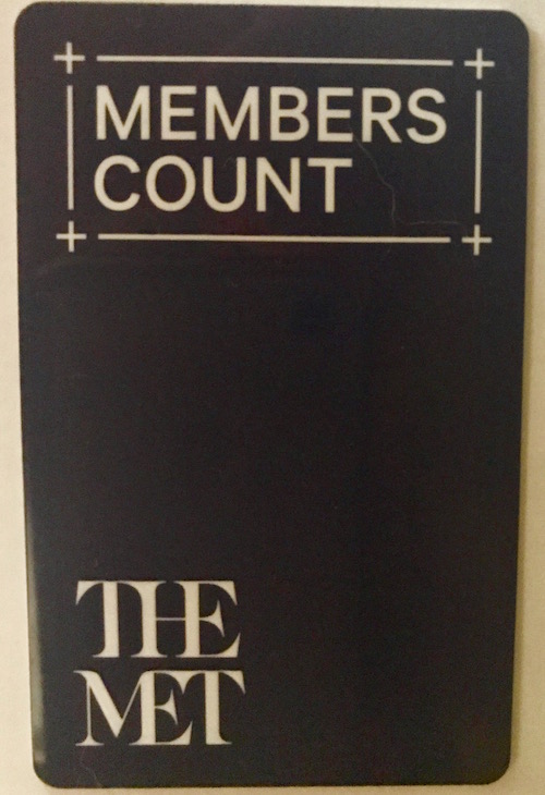
Yes . . . and? Members know that “members count”—that is why they are willing to shell out hundreds, if not thousands, of dollars each year for an institution that they could otherwise visit for free. They believe in the Museum’s mission, and they recognize that their membership helps support it. What, then, is the purpose of this redundant mantra?
For starters, it reeks of desperation. Embroiled in $40 million of debt and tarnished by the recent departure of director Thomas P. Campbell, the Met is, it seems, out of ideas. Its car isn’t driving fast enough, so it’s reinventing the wheel. Everything, from its iconic tin buttons to its plaza’s classic fountains, is now subject to change.
The slogan speaks, too, to what James Panero identified in a December 2016 feature as the Museum’s desire to become, in the words of Philip Newell Youtz, “socially-oriented”—that is, “a collection of people surrounded by objects, not a collection of objects surrounded by people.” By emphasizing the members, and not the art they support, the new cards reveal the Museum’s muddled priorities. Members count because art counts. Evening receptions for members at the Museum are nice, but they are nice only insofar as they provide further opportunities to engage with the Museum’s art.
In this way, the card and its slogan make manifest the Museum’s deep-seeded fear that art is not enough. Like the replacement of the symbolic “M” logo, inspired by Fra Luca Pacioli’s woodcut, with “THE MET,” the new card attempts to explain with words something that was already understood in an image. Portrait of a Carthusian indicated, by itself, both “THE MET” and “MEMBERS COUNT”: members count, the Carthusian’s stern gaze communicated, because I, a painting at the museum you support, count.
But the Met now trusts museumgoers—even long-time paying members—neither to know that paintings count nor to recognize that they convey meaning. A picture, the Met seems to believe, is no longer worth a thousand words; rather, it requires a banal mantra, an Instagram-worthy cocktail, and a star-studded ball hosted by Anna Wintour to explain and illustrate its significance. The Museum’s explanation for its 2016 logo change is telling: “The most effective way to create intuitive and instant recognition was to focus on the name, not to rely on a symbol that needed to be interpreted or learned.” Not to rely on a symbol that needed to be interpreted or learned? Of what does art consist, if not of symbols that need to be interpreted and learned? If, as the Met asserts, we can’t rely on symbols that need to be interpreted and learned, then we may as well give up art museums altogether.
Of course, the more the Met continues down this misguided path, the more necessary its new mantra will become. If the Museum presents itself as no different from any other nightclub frequented by the Kardashians, then its art-loving members may indeed begin to question why they should support an art museum whose value is not, apparently, derived from its art.
At the bottom of Petrus Christus’s portrait, a fly sits atop a windowsill—a symbol, the Met’s catalogue tells us, of death and decay and a reminder of the transience of life. In its latest effort to keep its own death and decay at bay, the Met has removed Christus’s painting from its membership cards. But the Carthusian’s fly is unlikely to be so easily swatted. If the Museum continues its campaign, the doomsayer fly may be back soon . . . and with a buzzing vengeance.