Beauty is that reasoned harmony of all the parts within a body, so that nothing may be added, taken away, or altered, but for the worse.
—Leon Battista Alberti,
On the Art of Building in Ten Books
I am for messy vitality over obvious unity. I include the non sequitur and proclaim the duality.
—Robert Venturi,
Complexity and Contradiction in Architecture
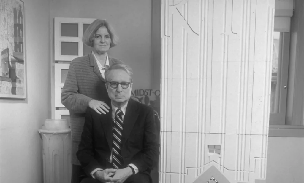
At least since 1940, when Hitler’s Luftwaffe gutted Hampton’s furniture store directly to the West of London’s National Gallery, the prized site on the northwest corner of Trafalgar Square has been the subject of public controversy. The government bought the bombed-out, irregularly shaped site in the late 1950s, intending to build an addition to William Wilkins’s stately neoclassical museum that presided over the entire north face of Trafalgar Square. But postwar austerity dictated that the empty plot remain empty, and for more than twenty years one of central London’s choicest pieces of real estate was put to use as a parking lot. In the early 1980s, the government sponsored a public competition for a mixed-use commercial building that would provide additional gallery space for the National Gallery on its top floor. Representatives from the museum (who wanted the distinguished firm of Skidmore, Owings & Merrill) and outside assessors could not agree on an architect; finally, in 1983 revised plans submitted by the firm of Ahrends, Burton & Koralek were grudgingly accepted by all parties. All parties, that is, except the Prince of Wales. In an infamous speech to the Royal Institute of British Architects in May 1984, the fledgling architecture critic abandoned the usual royal pieties and denounced the design as a “monstrous carbuncle on the face of a much-loved and elegant friend.” Farewell, Ahrends, Burton &c. Then came the dei ex machina. In 1985, the three brothers Sainsbury, business magnates, offered to pay for a proper addition to the museum, skip the mixed-use commercial compromise. A worldwide search for an architect began, producing a short-list that included such luminaries as Henry Nichols Cobb of I.M. Pei and Partners, James Stirling, and Robert Venturi. The judges fell for the “gentle” postmodernism of Venturi. It turned out to have been a strikingly efficient choice. The Philadelphia-based architect and his associates quickly drew up plans and were able to begin construction in 1988. This past summer, the Sainsbury Wing of London’s National Gallery opened on time, within budget, and to a veritable cataract of controversy.
Perhaps this was only to be expected. The architecture of the National Gallery has always attracted an abundance of criticism, even before it was really the National Gallery. Recalling the museum’s first venue, when in the 1820s it occupied a townhouse at 100 Pall Mall, adjacent to its current location, the novelist Anthony Trollope described “a dingy, dull, narrow house, ill-adapted for the exhibition of the treasures it held.” And in his monograph on the history of the museum and the Sainsbury Wing, the British architectural critic Colin Amery reports that “Poor Wilkins was criticized for everything” when his building was completed in the late 1830s.1 So in one sense, it was only business as usual that Robert Venturi’s design for an addition to the National Gallery should have occasioned heated controversy from the moment that his first sketches, carefully preserved scribbles made on menus from Pan Am’s Clipper Class and the Savoy, were exhibited to the delight and rage of the British public several years ago. What provoked one wag to disparage Venturi’s “Clipper-Class classicism” inspired others to excesses of praise.
The architecture of the National Gallery has always attracted an abundance of criticism.
Nevertheless, by the time the Sainsbury Wing opened, it had become clear that Venturi’s building represented something more than just another chapter in the saga of the National Gallery. Not only is the Sainsbury Wing Venturi’s most ambitious and high-profile project to date: it is also a kind of summary of the highly self-consciousness historicism that the architect has been advocating since his “gentle manifesto,” Complexity and Contradiction in Architecture, helped to usher in postmodernism in 1966. Undertaken at a moment when postmodernism was enjoying a last, intoxicated building spree, the Sainsbury Wing was completed in a period of aesthetic as well as economic stagnation. And while Venturi has obviously spared no trick to endow his new building with jauntiness and impish esprit—one observer, meaning to praise, described it as a “slice of beautifully iced cake”—the overall effect is disconcertingly retrospective, not to say valedictory. Just as Phillip Johnson’s AT&T building stands as an inaugurating monument to postmodernist coquettishness—Miss Havisham before the wedding, as it were—so it is likely that the Sainsbury Wing will come to be seen as one of its terminal gestures: Miss Havisham in later years.
None of this is to deny that Venturi has brought considerable ingenuity and, in places, even discretion to his design. His building rises modestly to the same, relatively low, height as does Wilkins’s original, and its front façade is clad in the same attractive Portland stone (other façades are faced in brick or glass). Venturi has also been generally well served by the craftsmen he employed. The stone work, especially the interior stone work, is exceptionally fine by today’s standards. Indeed, many elements of the building, taken individually, are almost exquisitely accomplished. The most important success, or partial success, is the suite of sixteen galleries (about 15,000 square feet altogether) on the main floor, specifically designed to house the National Gallery’s superb collection of early Renaissance paintings. In some ways, they are models of contemporary gallery design, well and evenly lighted, predominately by daylight from banks of clerestory windows. We are told that temperature and humidity are automatically and precisely controlled by computer to protect the fragile wood-panel paintings, and there is even a “micro gallery” full of computers waiting to dispense information about the collection to curious museumgoers. (To what extent the curious substitute a stint in front of the computer for encounters with the works of art is another question.)
Technologically, anyway, the Sainsbury Gallery is something of a show piece. It is only architecturally that it fails. As with so much postmodern architecture, its chief problem is an excess of cleverness. This is evident everywhere, from the placement of doorways to the handling of the elevation. One of Venturi’s favorite tricks is the diminishing perspective act. We get several versions of this in the main galleries. For example, both the magnificent Cima altarpiece, The Incredulity of Saint Thomas (c. 1504), and Raphael’s Christ Crucified (c. 1503) are framed by a series of arched doorways, each narrower than the one before, each echoing the shape of the painting. The result is that both look like images seen through the wrong end of a telescope.
Mr. Amery cites the enfilade galleries at Sir John Soane’s great Dulwich Picture Gallery as a precedent—and ergo as a justification—for this melodramatic manipulation of perspective; but the difference is that Soane did not make his gallery into a circus funhouse of optical effects and gratuitous historical echoes. In fact, Venturi’s use of diminishing perspective is a perfect illustration of what Robert Musil called the “secret law that will not permit man any kind of imitation without getting an exaggeration along with it.” It’s not the idea of enfilade galleries with diminishing perspectives that’s a problem (here as elsewhere, Venturi’s architecture is only too full of good ideas), it’s the way they are realized by the architect. As Musil goes on to observe, “in bad epochs the most frightful buildings . . . are made according to principles exactly as beautiful as in the best epochs”—though whether bad epochs make bad architects or the other way around is worth debating.
None of this is to deny that Venturi has brought considerable ingenuity and, in places, even discretion to his design.
In any event, the Sainsbury Wing is a graveyard of ideas gone awry. Some of them are details: the Tuscan columns that appear to have swollen ankles from standing too long on those hard museum floors; or the appalling iron work that seems to have been made by a cookie cutter (no wonder one of blacksmiths approached about the contract is reported to have refused to bid on the job); or the warren-like asymmetrical galleries for temporary exhibitions in the basement; or the grotesque, hypertrophied arches that float over the main stairway with mocking purposelessness.
One of the most spectacular failures in the building is the grand stairway itself. Set between a glass curtain wall that looks out upon the old Wilkins building and a stone wall punctuated with oversize windows and decorated with a frieze inscribed with the names of various Renaissance artists, the stairway is clearly meant to be an architectural statement of serious pretension. Mr. Amery compares it to the grand stairway at the Alte Pinakothek in Munich and tells us that the glass wall is “reminiscent” of Joseph Paxton’s industrial-age architecture. One wonders what the large, stylized cornices that follow the stairway down to the basement level are reminiscent of: my candidates are the paintings of cornices and moldings by Roy Lichtenstein. “The stairway does offer its own surprises,” Mr. Amery continues. “Look up from the bottom and sense the shortened perspective; look down and the staircase suddenly seems to be surprisingly long.” Indeed, the sense of vertigo as one looks down is almost overwhelming, and one can only hope that the National Gallery has kept up its premiums for liability insurance. We might vary the title that Marcel Duchamp gave to one of his ready-mades and baptize this stairway “In Advance of a Broken Leg.”
The exterior of the building is in many ways even worse. Here Venturi’s addiction to cleverness, to cute historical quotation, to oblique stylistic allusion builds to a quiet frenzy of fatuity. He has exactly duplicated Wilkins’s Corinthian capitals but has distributed the pilasters they adorn in coy disregard for symmetry and proportion. Mr. Amery dryly notes that “[t]he closely packed pilasters at the eastern end of the new façade look as though they have been drawn back and folded away, like a screen.” Precisely! But an important public building is not a stage set, and its façade should not look like a folded screen. Venturi continues the string courses and balustrade from the old building for a few yards and then stops. Why? He duplicates the blind windows from the old building but suddenly discontinues the molding after the second window. Why? As the façade stretches West toward Whitcomb Street it becomes blanker and blanker, finally dissolving into a flat sheet of stone. Why?
With the Sainsbury Wing, Venturi has given us a lavish example of what he called in Learning from Las Vegas (1972) the decorated shed. Strip off the Portland stone, take away the pietra serena columns and skirtings, and what do you have? An asymmetrical modern building distinguished by fancy air conditioning and lackluster proportions. The building itself betrays no architectural logic, no internal unity, no animating form. Its roughly six-sided shape is not so much a response to the irregular site as an exploitation of it; minus the postmodern appurtenances, the Sainsbury Wing is an unarticulated blob.
One of the most spectacular failures in the building is the grand stairway itself.
Some architectural writers distinguish between decoration, which is arbitrary and dispensable, and ornament, which has some organic connection to the structure it adorns and the purpose the building serves. Like all postmodernists, Venturi strives to turn architecture itself into a form of decoration. Inside and out, he has larded his building with architectural references—not only to Soane and Paxton and Wilkins, but also to Wren, to Lutyens, and to many classical Italian architects. Yet the references are essentially arbitrary, decorative. It is no wonder that the word “reminiscent” crops up so often in discussions of Venturi’s work. He produces buildings that are reminiscent of all manner of past architecture but that somehow fail to achieve architectural status themselves. Unlike mere workaday structures, however, they are festooned with knowing allusions and reassuring materials. This is part of what gives them their appeal: the allusions are there for students of architecture, the pretty stone for the man in the street who has become tired with the glass boxes of modernist architecture and likes pastels.
Even before it had officially opened, the Sainsbury Wing was described by one critic as “the cruellest disappointment I have ever suffered as an architecture critic.” Another writer countered by asking “Can London take a joke?”—the idea being of course that a joke is a capital thing. These responses are revealing. There can be little doubt that jokiness is at the heart of the Sainsbury Wing, even as it is at the heart of postmodernism generally. In this sense, postmodernism is the Pop Art of architecture: it is, as Phillip Johnson once put it, architecture with a giggle. But more perhaps than any other art, architecture can joke with impunity only when the underlying seriousness of its vocation is secure. Otherwise, what was intended as enlivening wit merely fosters a brittle self-consciousness and shallow cynicism: what was meant to be funny turns vapid, sour, pointless. And this is the unhappy lesson of the Sainsbury Wing: because architecture must finally be a serious pursuit if it is to be anything, its failures—its flirting with arbitrariness and obsession with irony—can indeed be cruel as well as disappointing. The same might be said of life, but that is another story.
Notes
Go to the top of the document.
- A Celebration of Art & Architecture: The National Gallery Sainsbury Wing, by Colin Amery; National Gallery Publications, 144 pages, £25; £15.95 paper. Mr. Amery, one of the architectural consultants who recommended Venturi for the job, has really given readers two books here: a thoughtful and illuminating history of the evolution of the National Gallery from its inception in the 1820s up to the Sainsbury competition, followed by a lavish exercise in architectural cheerleading for Venturi. He is trustworthy up to about page 49. Go back to the text.