Hermine Ford is an abstract painter who splits her time between New York City and Nova Scotia. Active since the 1960s, she has undergone a number of stylistic shifts throughout her career. At some point in the 1980s, around the time artists like Elizabeth Murray and Frank Stella were conducting similar experimentations, Ford began producing irregularly shaped and multiple-paneled paintings that “liberated” her work from the strictures of the rectangle. Today, Ford continues to make shaped paintings, and a number of her most recent works can now be found on view at the New York Studio School in lower Manhattan. On through December 1, “Toward the Beginning” gives us an artist who, though she certainly makes compelling conversation with prominent figures such as Murray and Stella, has developed a formal and expressive language that is wholly her own.
The paintings in “Toward the Beginning” offer contrasts between swirling mosaic-inspired patterns and solid and vibrant overlapping shapes. Although her works, mostly oils on carved wooden panels, are essentially two-dimensional, Ford’s contrasts of color and design build movement and depth. Any background has been trimmed away, which causes the forms to make an even more striking impression. The works are large, almost human-sized; each wall holds only one or two paintings. Some panels are sharply cut and committed to polygonal, geometric shape. Others are more casually constructed; they curve into circles, which resonate with the inlaid mosaic designs to offer a spiraled flow. Most of these mosaic sections are busy with painted squares and triangles––some follow a strict color blueprint, while others seem more improvised. In “Toward the Beginning,” Ford’s style is evergreen, and repetition becomes almost meditative.
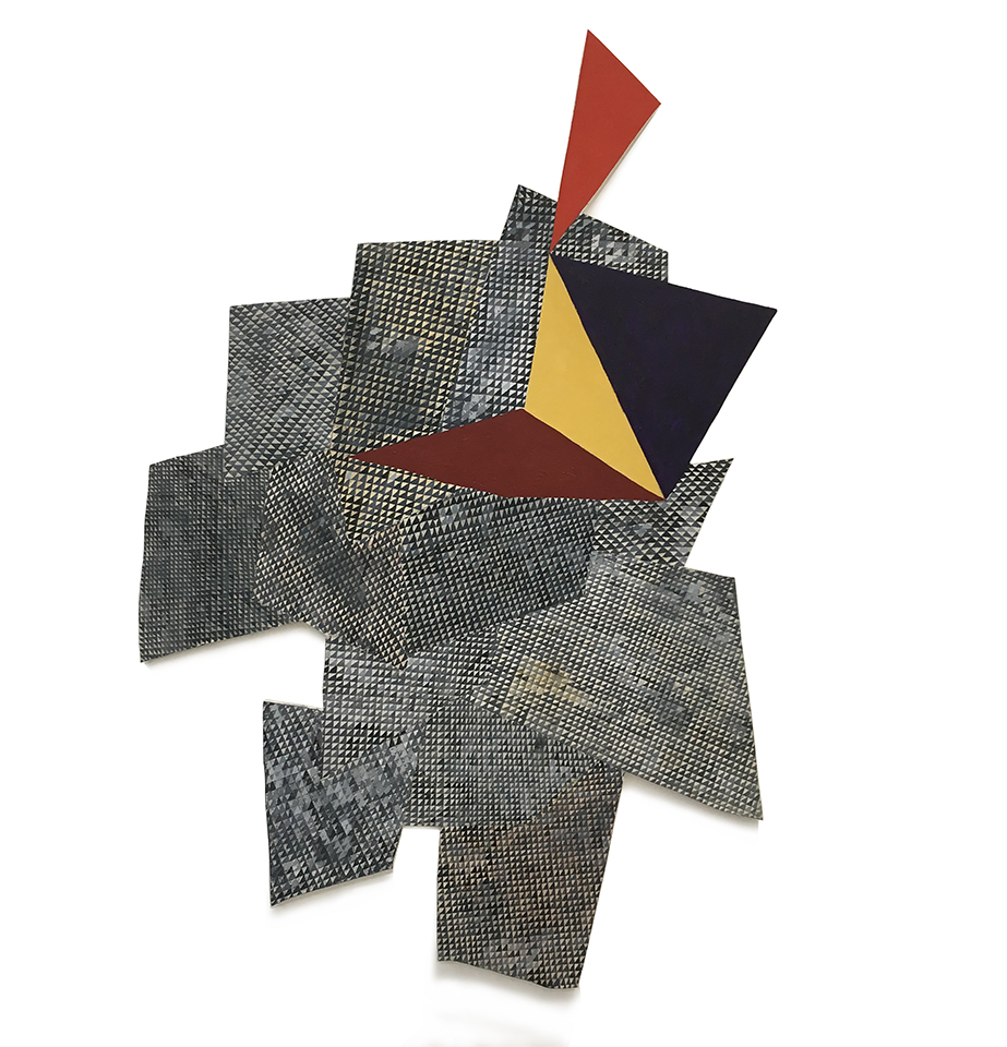
Ford could have dropped a stack of papers and used the resulting pile as inspiration for the shape of Hat’s Off (2018). Overlapping, patterned polygons provide the visual foundation for the stagger-structured work. The polygons in back offer a mosaic of squares divided into alternating light and dark right triangles, and in some panels, those squares are rotated to create diamond shapes. These are painted in a predominantly crisp, linear manner, but some “tiles” of the mosaic have been intentionally smudged by Ford, disrupting the work’s even design. This effect resembles that of a Roman mosaic weathered by history, having lost some tiles or entire sections. Ford visits the ancient city every year to find inspiration in the art that comes from rubble. (She is also the daughter of Jack Tworkov, who left another legacy for her to comb through.) On top of the stack of patterned polygons piled on the wall in Hat’s Off are flatly colored triangles and diamonds—royal purple, mustard, scarlet, and maroon. The silvers and blacks of her foundational forms are so neutral that even a deep purple triangle seems to “pop” in comparison.
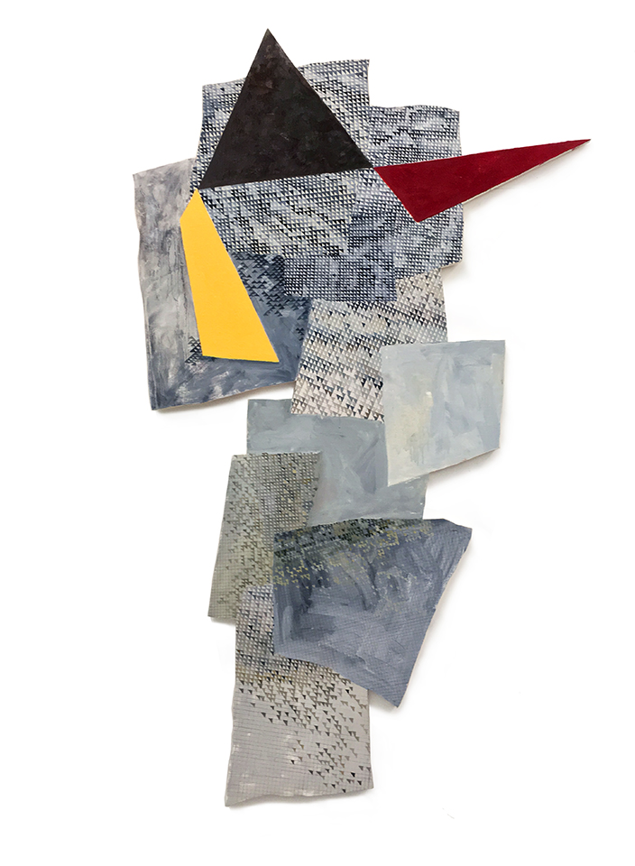
If you laid Liar, Liar (2018) down in a playground, enterprising small children might be able to make a game of it, like hopscotch. Perhaps this was the inspiration for its title, a classic schoolyard taunt. The piece is composed of about ten variously shaped panels, each displaying a different shade of gray. Liar, Liar adapts the oft-used technique of juxtaposing a busy backdrop with a vibrant, superimposed shape. Some of the rear polygons have that same mosaic quality, and some have a blurred version of it, but others are patternless with visible brushstrokes and clunky color blends.
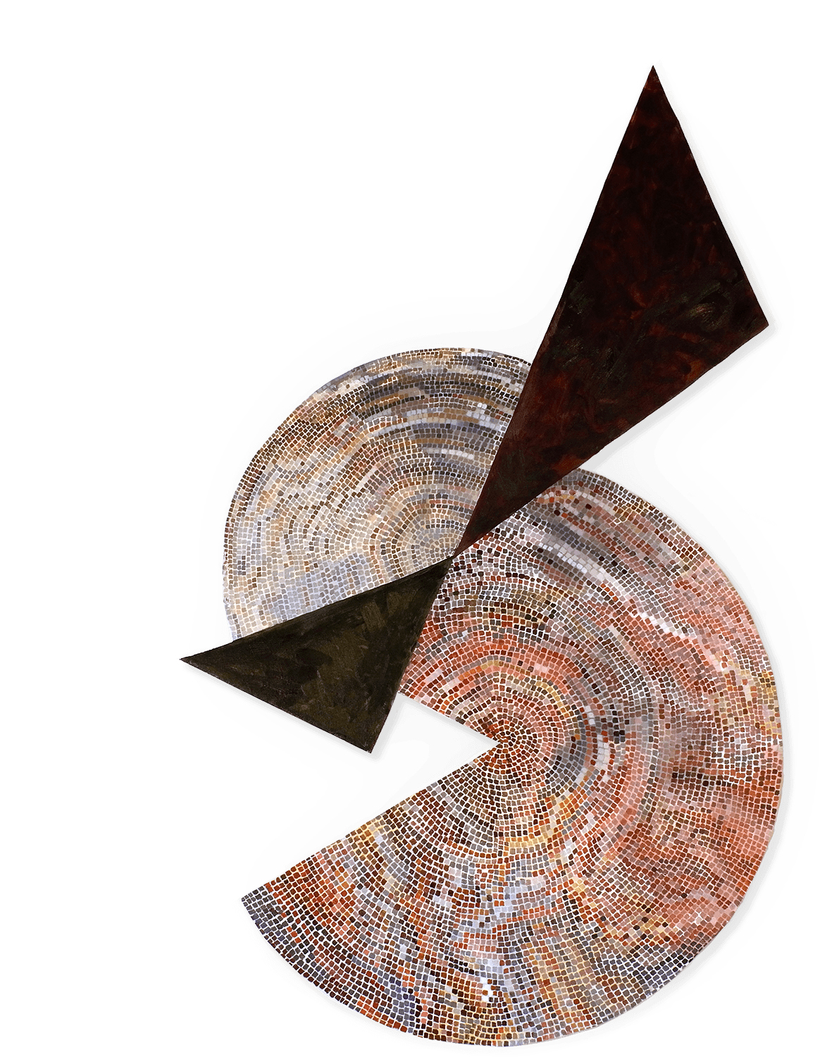
Moon Dial (2019) is a composite of two circular mosaic coils. These two shapes do not overlap like most of the others: they come up abruptly against two darkly colored triangles, whose points barely touch to form a bow-tie shape. The lower circular form, out of which a pizza slice–shaped section has been removed, is made up of salmon, coral, periwinkle, and maroon tiles. A smaller form above has a far more neutral palette. Burnt gray, taupe, black, and lavender tiles add texture, but the top shape notably lacks the rusty hues of the larger and lower one. The mosaic here appears to be the “cleanest” of all the works in the show: no smudges, and minimal colored pencil tracing marks.
Six of the works are untitled. Four are paintings, similar in execution to Ford’s titled works, but two are drawings, made of ink, watercolor, gouache, pencil, and colored pencil. If her paintings are live rock-’n-roll concerts, these drawings are the acoustic covers. The four painted panels feature the motif of star-shaped forms. Some stretch vertically, and some drag to the side. These are typically angled with irregular slants, and usually have four or five points. The foundational panel of these untitled works follow the pattern of their sibling Hat’s Off. Triangles are sandwiched into squares to create interesting optical illusions. Untitled (368-17) nearly abandons that motif in its three panels that are adjoined by stars. Each section has a different style. One features tile-sized squares that appear to extend beyond the boundaries of the panel, another has a freehand wicker-basket appeal that blurs into an icy gray, and the third has the same general aesthetic as the second but is entirely blurred over.
“Toward the Beginning” is on view at the New York Studio School through December 1. For those interested in hearing more about the work, a gallery conversation will be held between the artist and Stephanie Buhmann and Nora Griffin on Monday, November 25, at 6:30 pm.