Once upon a time, around the middle of the previous century, art was not required to address political and sociological ills. Neither was it expected, as Stuart Davis once complained, “to mean all kinds of things” and be “the answer to all kinds of questions that no one can answer,” nor did ambitious art have to resemble anything but itself.
That fairy-tale opening is deliberate. In some sectors of today’s art world, the notion that emotions and intellect could be stirred through purely visual, abstract means, absent words or reference to current events and evils, is regarded as belonging to a remote, possibly unreal past. Yet, at the same time, there seems to be a groundswell of new interest in the abstract painters of that fairy-tale moment—the artists who, loosely grouped under the rubric “Color Field,” challenged the dominance of Abstract Expressionism in the 1950s and 1960s with paintings whose emotional burden and associative power were carried not by anxiety-driven, dragged gestures, but by near-anonymous surfaces and fine-tuned color relationships. These days, despite the primacy of political and socially conscious narratives, we’re seeing more exhibitions of significant works by Color Field painters than we have in the recent past—except at the Museum of Modern Art, despite the museum’s substantial holdings of important examples. But that’s subject for another discussion.
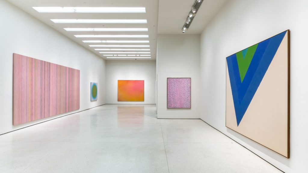
Elsewhere, works by Helen Frankenthaler, Morris Louis, Kenneth Noland, Jules Olitski, and Larry Poons have all been showcased in recent exhibitions, along with others who shared their aesthetic, such as Alma Thomas, Sam Gilliam, and Gene Davis. Take, for example, last year’s “Spilling Over: Painting Color in the 1960s,” at the Whitney Museum of American Art, a notably broad view of the subject that included major works from the collection by Frankenthaler, Louis, Noland, and Gilliam; a vast Noland Stripe, with its long bands of delectable hues, confronted you as soon as you stepped from the elevator. Frankenthaler and Gilliam were featured, too, in “Epic Abstraction,” the rethinking of the installation of the modern collection at the Metropolitan Museum of Art, on view until last February. (Many included works remain on view in the galleries.) Currently, since the beginning of the past year, there is “The Fullness of Color: 1960s Painting” at the Solomon R. Guggenheim Museum, an installation also drawn from the museum’s collection, which places Frankenthaler, Louis, Noland, Olitski, Davis, and Thomas alongside less familiar, sometimes non-American painters similarly concerned with the expressive possibilities of chroma.1 (More about that later.) Most recently, there’s the exhilarating “Jules Olitski: Color to the Core,” a survey of his first mature, color-driven canvases, at Yares Art, on Fifth Avenue between Fifty-seventh and Fifty-eighth Streets, installed in the gallery’s two fourth-floor spaces.2 (No appointments needed, at the time of this writing.)
“Color to the Core” is a play on the term used to categorize the seminal abstractions on view. Known as the “Core paintings,” they are constructed with over-scaled rings and arcs of saturated color, enclosing or loosely embracing warped ovals and constellations of free-floating, imperfect discs. The series has its origins in a group of canvases with floating organic shapes made with potent, resonant dyes, begun in the spring of 1959—Olitski (1922–2007) was thirty-seven—and exhibited at French & Co., New York, the following year. With their saturated hues, they marked a startling change from the brooding, dramatic paintings that preceded them.
The earlier works, known as the Spackle paintings, were distinguished by a subdued, near-monochrome palette of grays applied with near-sculptural, thick impasto. That the Core paintings, with their suave surfaces and intense chroma, seem to repudiate or at least reinvent everything characteristic of the works that came before them probably owes something, at least in part, to the new “cool” version of abstraction proposed by some of the other, younger painters (such as Kenneth Noland) being shown at French & Co. Like Olitski, they had been selected by Clement Greenberg, who, at the time, was charged with creating a contemporary program for the distinguished gallery. But, as is made clear by the works on view at Yares Art, which allow us to follow Olitski’s inventive exploration of the implications of unmoored rings and ovals of radiant colors, it takes nothing away from the originality or potency of the Core paintings to note a connection with Noland’s Circle paintings. Quite the contrary. The generous selection not only reveals the Core paintings’ connections with the work of Olitski’s peers but also underscores their idiosyncrasy and individuality.
The Core paintings’ sometimes dissonant orchestration of unnameable, often surprising hues is entirely Olitski’s own, announcing his gifts as an inventive and expressive colorist. So is the quirky character of the wavering rings, thick arcs, hovering discs, and nested ovoids that sparsely populate the canvases. In contrast to Noland’s Apollonian, confrontational Circle paintings, with their concentric rings of subtle colors and declarative, still centers, Olitski’s Core paintings are Dionysian and animated, a little wonky in a way that befits an association with the god of wine. Their liveliness results from their refreshingly “imperfect” compositions, constructed with shapes whose wavering edges remind us of the presence of the hand, as they enter into a tense relationship with the crisp vertical and horizontal boundaries of the canvas. In Necessary Light (1959), the earliest Core painting in the installation, two vertical ovals—the lower one, pale yellow and even more irregular than the black shape above it—are stacked against a blue-black ground, pushed towards the edge of the canvas, and anchored by a wobbly brown form that surrounds both. Or is that a still more distant layer revealed by a gap in the blue-black, as if the surrounding hue were being repelled by the ovals? A tremulous red disc at the edge of the pale yellow oval further complicates the spatial implications.
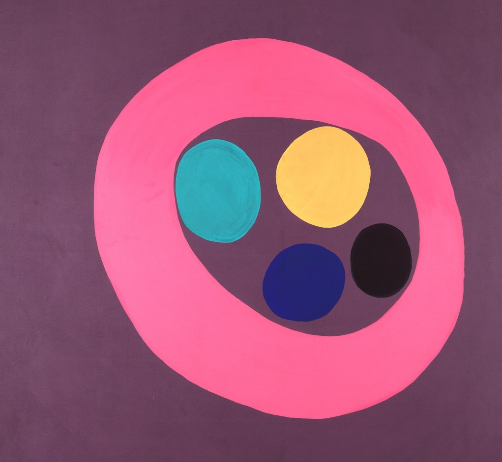
The intensity of the Core paintings is partly due to Olitski’s having soon abandoned dye for Magna acrylic, known for its luminosity (and, as it turned out, toxicity). Their unexpectedness is bound up with his highly personal color sense, which walks a tightrope between the ravishing and the vaguely disturbing, sometimes in the same painting. In Fanny D (1960), for example, a swelling ring of Schiaparelli pink hovers, off-center, against an expanse of purple-gray, enclosing four almost-discs of different sizes and different hues—green, gold, indigo, and black. Some discs press against their confines, suggesting potential motion, but it’s the unpredictable, not obviously harmonious assortment of hues that keeps us engaged and keeps the painting from being simply beautiful. And if we look closely, we discover that despite the assertive quality of the picture, there have been adjustments to the color along the way, testimony to the evolution of the composition: overpainting, for example, revealed by small escapes of green around the black disc. It’s reminiscent of the way Henri Matisse allowed the fragmentary evidence of color changes to remain visible in his early canvases—the deep red underlying and warming an expanse of black, say—creating subtle vibrations from a distance and adding complexity from a close viewpoint. In Olitski’s expansive After Five (1961), the atypically brushy application of the glowing ultramarine field plays a similar role.
At the opposite end of the gallery, Lucy’s Fancy (1960) stares us down with a pair of oversized discs, acid yellow and tomato red, separated and framed by bands of orange and turquoise against purple-brown. The confrontational image, with its mouth-puckering palette, is at once seductive, slightly threatening, solemn, and vaguely cartoon-like. Part of the impact of Lucy’s Fancy and many other Core paintings derives from the way the burgeoning, implicitly soft shapes and oversized, aggressively cropped, curvaceous pools of color hint at tactile memories of the female body.
These allusions are sometimes reinforced by Olitski’s suggestive titles: Passion Machine, Shakeup Sally, Pink Ishtar Belly, Dream Lady, Fatal Plunge Lady, or the unequivocal Queen of Sheba Breast (a 1963 painting in the collection of the Yale University Art Gallery, not included in the Yares exhibition). This is neither to suggest that the Core paintings are disguised or caricatured evocations of female anatomy reduced to titillating essentials, nor to deny the possible, possibly enriching readings and associations provoked by Olitski’s titles. But those associations function as overtones, implying the existence of playful metaphors without compromising abstractness.
As the series progressed, Olitski continuously explored variations on his theme of concentric ovoids, expanding the arcs and rings, setting ample sweeps against unpainted canvas to intensify color, and allowing the ovals and discs to float free. The result was to suggest more expansive space than in the earlier, denser configurations, such as Lucy’s Fancy, in which the two discs are tightly framed and conjoined to form a kind of figure eight against a continuous ground. In later Core paintings, such as Free Spirit or Circle Stretch (both 1963), the “enclosing” ring expands exponentially against an indeterminate white field, sometimes breaking into disjunctive arcs, and becoming so large that it can no longer be contained by the boundaries of the supporting canvas. Within that generous scoop, slightly distorted discs, ovals, and, occasionally, short, blocky strokes, like broken pieces of a ring, drift unconstrained. In the economical Circle Stretch, a white oval against unprimed canvas is positioned above a break in the surrounding over-scaled ring, now fusing with the ground, now separating from it, to create a new kind of indeterminate space.
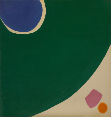
In other Core paintings, such as Wet Heat Company (1963), an ovoid, here subtly shading from red-orange to yellow-orange, has grown so enormous that it all but fills the canvas with what we read as only a fraction of the implied shape; a softly defined, purple, rectangular swipe kisses the orange shape in the minimal remaining space, lower right, while below that, a small olive-green disc floats. Conditioned as we are to interpret changes in size as signaling distance, it’s impossible not to read the three incidents as describing deep space. Despite the declarative flatness of the paint application, which emphasizes the literal surface of the canvas, we see them as moving away from us; the hierarchy of color—aggressive hot orange in the largest shape and recessive cool green in smallest—reinforces this involuntary but irresistible interpretation. It’s as if, like Gulliver, we had entered the world of the Brobdingnagians and were able to take in only fragments of gigantic bodies; the rest expands beyond our field of vision.
What makes the implied infinite space of these paintings all the more surprising, in relation to the full trajectory of Olitski’s work, is his later insistence on acknowledging the boundaries of the canvas, from the edge drawing in his spray paintings, which asserts the dimensions of his sheets of diaphanous color and states where the world of the painting ends and actuality begins, to the bold internal framing drawing of his last series. We have a glimpse of the origins of this conception in the second section of the show, in the informative but not entirely convincing Big Diagonal (1964); here, the disjunctive enclosing arcs of a late Core painting have hardened into broad (mostly) orange strokes at the periphery of the canvas, parallel to the vertical and horizontal edges of the picture, loosely enclosing a rectangle divided diagonally into pink and green.
We’ve been prepared for such a radical rethinking of structure by a group of intimate oil pastel drawings, sometimes on colored paper, made in 1963 and 1964. They offer entry into Olitski’s thinking, as he played with compositional and chromatic variations. In the drawings, the Core paintings’ solid shapes are indicated by scribbled, fraying zones and scrawled dots of color. These loose, roughly stroked areas are perhaps early manifestations of his avowed desire, stated in 1965, to suspend color in the air and have it remain there—an idea that led to his using sprayers to apply paint to his canvases, creating the pulsing, luminous paintings that initially established his reputation. Some transitional works, including the red-orange Color Flow (1965), a seamless shift from dark to light, anchored by two small discs that might have floated in from a Core painting, record Olitski’s early experiments with spraying and point to the future, when he would concentrate on sheets of pulsating color and seamless color shifts instead of the lively shapes of the Core paintings.
To see what happened next and to locate Olitski among some of his peers, we can visit the Guggenheim’s “The Fullness of Color: 1960s,” where his Lysander 1 (1970), a lush golden-rose spray, is installed with Trans Shift (1964), a bold Noland Chevron, with athletic blue and green bands plunging down the unprimed expanse. We also find Sarabande (1959), an opulent Louis somewhere between a mysterious Veil and an alluring Floral, along with a lush Frankenthaler and fresh, optically vibrating works by Alma Thomas and Gene Davis. We look in vain for one of Frank Stella’s flashy Protractor paintings of the 1960s, for one of Larry Poons’s vibrating Dot paintings, for something by Friedel Dzubas or Sam Gilliam, all of whom were investigating related ideas about the significance of color at the time, in notably different ways. Instead, we get a blurred version of a Noland Circle by the Polish painter, Wojciech Fangor, best known for his posters, and a tightly woven geometric “tapestry” of color by the Japanese painter Toshinobu Onosato. None of these works has been on view in recent years, so we must be grateful for all of it, although without returning to the museum to check the label, I’m not altogether certain that the Fangor belongs to the Guggenheim—he doesn’t appear in the online catalogue. While one might quibble with certain inclusions and absences, generally “The Fullness of Color” provides a capsule context for the Olitski show, so we must be even more grateful.
“Jules Olitski: Color to the Core” is a splendid introduction to one of the most radical and innovative abstract painters of the recent past. The show is accompanied by a gorgeously illustrated catalogue reproducing even more key works than are represented in the gallery, along with an informative chronology and essays by David Ebony, Patricia L. Lewy, and Alexander Nemerov. Let’s hope that Yares Art will organize future exhibitions tracking the rest of Olitski’s long working life. That would further emphasize the importance of the Core paintings since, as an accomplished octogenarian who had explored many different possibilities of what an expressive abstract painting could be, responding to new materials and new conceptions over the years, Olitski returned to the cast of characters and the intense color of the Core paintings in his last works, but even more so. That makes the exuberant, engaging works in “Color to the Core” not only exciting and compelling in their own right, but also prescient.