A gleam of straightforward color meets you upon entering “Loggia,” an exhibition of Kim Uchiyama’s paintings at Helm Contemporary, New York. Beauty comes across immediately. This would be enough on its own. But if you look longer, you will find many potent constituents that animate and deepen this beauty.
As in her painting Threshold (2024), Uchiyama’s quiet and balanced yet complex work melds several traditions to achieve originality. As a viewer steeped in the broad yet distinctive New York style of abstract post-war painting, I was quickly reminded of the work of several powerful and inventive artists: Doug Ohlson, David Novros, and the early Brice Marden, all of whom carried forward geometric modernism and color-field painting from a base in abstract expressionism. I can’t say definitively that Uchiyama is influenced by these artists, but the forms she has chosen suggest this artistic lineage. In Threshold, she places a set of vertical bars of color just under a horizontal bar, which achieves a strong spatial presence, especially as these forms are used simply, nakedly, without any surrounding distractions. It’s an association of forms that belongs to anyone—as an artist, the challenge is to make them yours, which Uchiyama does.
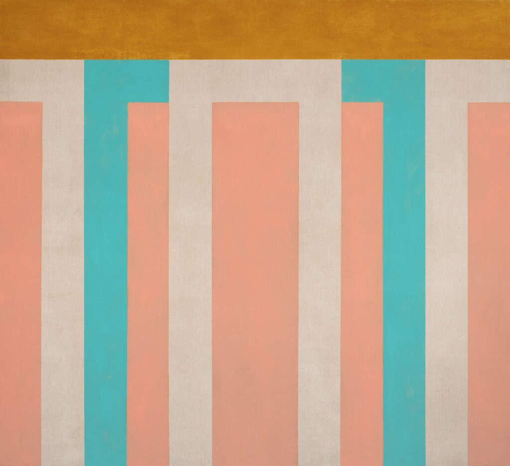
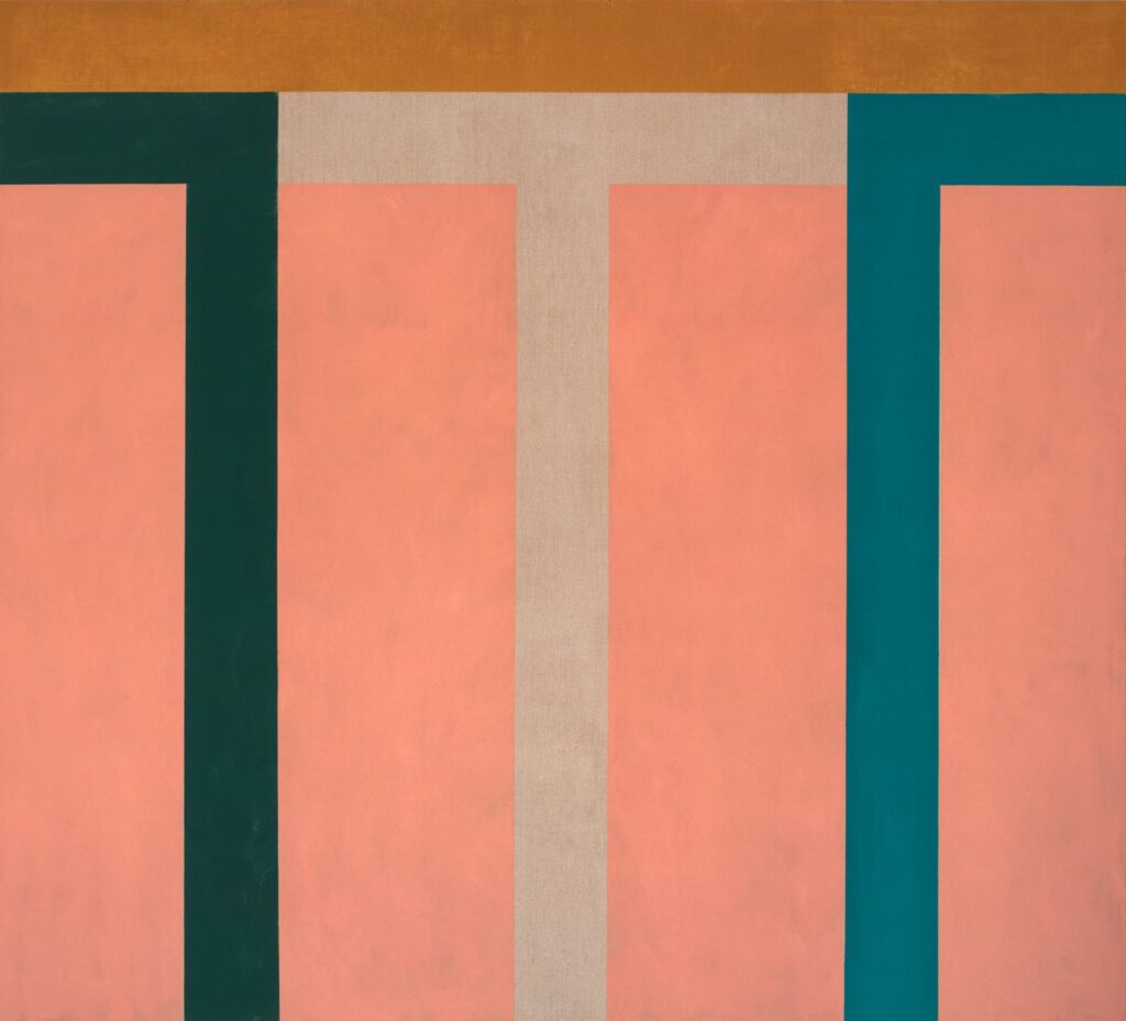
In Equinox (2023), one horizontal bar balanced on a vertical bar centered beneath it calls to mind a post-and-lintel structure. This is not only a basic form to hold up a ceiling, roof, or doorway; it is also a fundamental arrangement of form, in both two dimensions and three. It exists with and without reference to a building. When you see a row of these forms, you see a row of columns, as in Portico 4 (2023). And a row of columns brings to mind Greek and Roman architecture. Uchiyama has spent time in Sicily in recent years, admiring the well-preserved ancient temples there. She has written that she was inspired by the post-and-lintel remains of such structures.
Sicily brings to mind bright sunlight and thus strong color. At midday, when extended shadows disappear, the colors of the ground, objects, and sky can be close in value—there isn’t a lot of contrast in brightness among colors. This kind of light is present in Uchiyama’s paintings, especially the larger ones. A painting displayed indoors does not have the interference of the sun’s glare and its reflections, so the action of close-valued colors is more noticeable than in the world itself. Negative space between forms (e.g., the columns) becomes an opportunity for this artist to control exquisite and surprising effects of color. (In absorbing the atmosphere of this location, Uchiyama joins another artist who produced a notable series on the Sicilian sun, Nicolas de Staël.)
The exhibition comprises three large paintings and six notably smaller ones. The larger ones are more successful. This is because certain arrangements and qualities of form in painting simply require more space to have their strongest impact. In this case, more color is more color. The color interaction needs space to act fully.
This is not to say the smaller paintings are unsuccessful, nor that big paintings are always better than small ones. Some things just work better big. In fact, the smaller pieces have an impact of their own: in each, all the shapes are seen together, which produces a unique effect on the eye—less an interaction of color than a mingling of all the colored shapes vibrating simultaneously. This difference abides whether you are standing close to or far away from the paintings. The smaller canvases are beautiful in their own way. Some viewers will undoubtedly prefer this beauty.
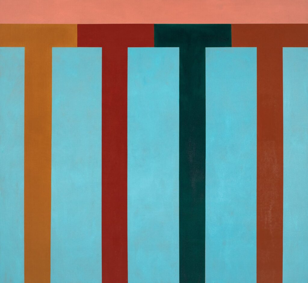
The procession of columns marches across the canvas horizontally. The philosopher John B. Onians posits that the columns in Greek temples intentionally mirror the rows of warriors in the Greek phalanx. The columns are of course upright, just like well-trained soldiers. Uchiyama’s implied sideways movements and vertical pressures are held in place by the emphasis on the surface itself as well as the pushing-out and pulling-in contributed by the balance of the colors in relation to the surface.
This surface is flatly, matter-of-factly painted, which allows the shapes and colors to do better their jobs of acting or remaining in place—establishing tension. If the artist had made a fetish of the surface material, these effects would be less effective.
Yet the color does not only remain on the surface. It creates feeling and space. Indeed, the color can bring you into the painting very strongly with the posts and lintels and other “openings” clearly acting as implied doorways. The post-and-lintel form also carries the architectural presence of weight and pressure, both down and up. The color is multipolar.
Not only are these paintings full of visual happening, but also they add something quite unusual to their abstract medium: they have sound. Various shapes appear that look like letters. There is a repeated T in one painting, suggesting a rhythmic tee, tee, tee, tee or te, te, te, te sound. In another, N is repeated: en, en, en, en and ne, ne, ne, ne. You’ll find R and an upside-down U as well. This sound is integral to the paintings—it comes from the shapes, and sound is a vibration, just as color is.
The almost-rigid arrangements of form initially appear staid, keeping the paintings reservedly peaceful at first viewing, but the activity of color and the implications of action, meaning, and sound grant the work a full vibrance—something like lying on the beach in the hot sun under the bright blue sky of Sicily, dreaming of the endless potency of Greek temples.